
Beauty Is In The Eye of the Beholder
I talk a lot about beauty in my studio, the pull it can have on us and how something or someone beautiful can captivate, excite and soothe our often fragmented and tangled senses. We live in a time where we are constantly bombarded with images of what beauty is and it can be very surface level and influencer driven, especially if you are scrolling on social media. No judgment – I do it too!!
As the saying goes – beauty is in the eye of the beholder – it is all very subjective to what you find beautiful and what feeds your soul. A huge part of my role in our clients projects is to find beauty for them, to see what meets their needs not just in the terms of function and form but what is going to make their heart skip a beat in a very good way for a very long time.
As a look back on January three moments of beauty stand out for me that I wanted to share with you. I’m also sharing my top 5 paint colours for ceilings (they don’t ever have to be simply just white) so keep reading to the end and see if any of them could be a fit for your beautiful homes.
Beautiful January Moments
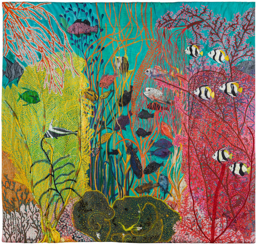
A visit to the AGO never disappoints and I sometimes simply pop in just to simply be in the Henry Moore wing – I love the light in this space and how the large sculptures can ground you even on the most blustery of winter days. But at the start of the year it was the Filipino artist Pacita Abad’s quilted and textured canvases that drew me in and made me stay a while. Her work is full of bold colours, whimsical patterns and they talk to her world travels and speak to cultural identity and social justice. She was a trailblazer and sadly like so many of the greats, her work was not celebrated in her lifetime, but it is certainly being celebrated now. She had several pieces featuring an underwater world and these combined with the most incredible lighting made you feel like you too were swimming in tropical waters. It was equally beautiful and powerful
A trip to the AGO is never complete without a visit to their bookstore. At some point I may have to put myself on a book diet but as long as I have walls to have bookshelves I know I’ll keep on buying. I get so much inspiration from a good book – the purchase seems quite harmless.
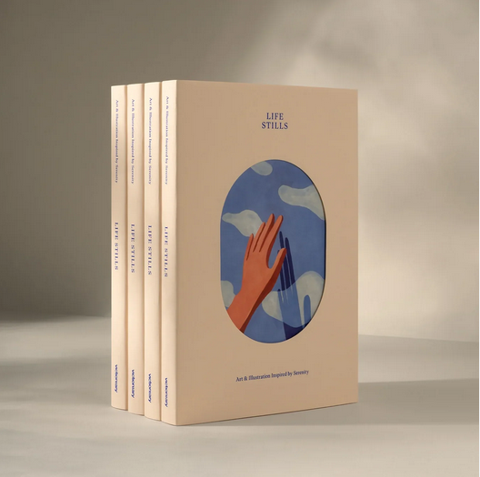
Anyhow, I digress, in the bookstore I came across the most beautiful book that now sits on my desk in the studio. Its called Life Stills – Art & Illustrations Inspired by Serenity. Trust me – give yourself the gift of this book and you won’t regret it. The book encourages viewers to pause and be present and to simply take in these beautiful and serene illustrations that run all the way from dawn to dusk. I close my book every night when I leave the studio and pick a random page to open it at the following day. Its such a simple delight. The colour palettes are wonderful and we’ve drawn inspiration from one such random page as a starting point for a colour palette for a clients primary en-suite. I have mine open on an Assouline bookstand that is the perfect size and fit for this book. I got mine in the bright yellow.
My third memorable beautiful moment this month came last week when I took part in a panel discussion as part of DesignTO. If you haven’t heard of DesignTO before, it is a non-profit arts and culture organization driven by the belief that design has the power to shape a more sustainable, equitable, and happy world. Each year, they host the DesignTO Festival, which marks its 15th anniversary this month. As Canada’s largest design event, the festival serves as Toronto’s official design week, celebrating creativity and innovation in design. It’s also an excuse to get out and leave your sofa in January.
Our panel was called Framing Perspectives: Craft, Space and the Power of Seeing and our moderator was the super lovely journalist and writer Sophie Donelson.
We spoke about the power of art and how truly anything goes – I can personally never see past a beautiful textile wall hanging or miss the opportunity to upholster walls and doors if the opportunity arises. We spoke about the power of art, the sometimes complex challenges that can arise in finding the perfect pieces for a project and how just like most things in life you’ll know when you’ve found the one. It was lovely to meet and engage with the other panellists and thank you to all who came out.
Wherever February takes you I hope you find some beauty. DesignTO runs right through this weekend with lots of talks and stand alone exhibits. I loved seeing first hand the hand-punched tapestries by Scottish designer Alisa McRonald at Fables in Yarn.
My 5 Favourite Ceiling Paint Colours
For ceilings I try to never use white and adore having a shade that’s a little darker than the wall colour – especially if the walls are light – in the living room above the ceiling is painted Farrow & Ball Shaded White which is a soft putty colour.

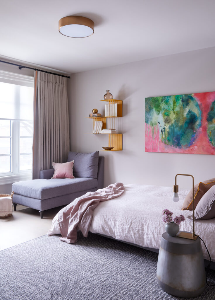
Another Farrow & Ball colour – this time we used Pavilion Blue on the ceiling. Its ethereal and so perfect for this bedroom.
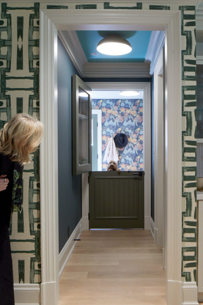
It’s hard not to get distracted by Reba who was our super model in this shoot – but if you look up you can see the cheeky ceiling colour. Cheeky because its called Arsenic and its in the hallway to my clients pantry! Another Farrow & Ball pick!
In this gorgeous remodel of a penthouse suite for our client we painted the ceilings throughout in Benjamin Moore Dove Wing OC-18.
In this gorgeous bedroom the ceilings are painted in Farrow & Ball Dimity. A soft blush that provides the lightest touch of pink!
Below you can see each shade and how they differ from each other.
Running left to right – Arsenic, Pavilion Blue, Shaded White, Dimity & Dove Wing.

February Calling!
February brings new beginnings and some perfect endings as projects start and close.
We are making the final edits to our section in a Toronto design book which will be published later this year and features images from three projects.
We are also in the thick of designing our table for the Butterfly Ball in May which is a large charity event to raise funds for Boost Child & Advocacy Centre. But more about this on another journal.
On a personal front I am going on a 3-day retreat with my design forum which will inspire and push my creativity. I am so grateful to this group of like minded souls who always bring their best and keep their hearts and minds open. I am so fortunate to be able to share and grow from others. I never want to stop learning and raising the bar for what we do and how we do it.
Now I just need to get a new book for the flight…….
Wishing you all a wonderful February from me and my wall of books!

Thank you all for your continued support and readership!
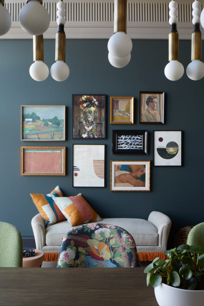
Credits, images, musings and some more contents of my head – Trio of header images all sourced from Pinterest and they can found on our Seasonal board. 4 Shallow Gardens of Apo Reef 1986 by Pacita Abad – I’m only realizing the name of this piece and it makes so much sense to call this underwater world a garden. 5. Life Stills published by viction:ary 6. our GGI studio gallery wall, photographed by Virginia Macdonald. Images 7-11 are all from our selected projects and all feature colourful ceilings, more images from these projects can be found on our website in the portfolio section. 12. colour chip images are from Farrow & Ball and Benjamin Moore.
Studio Collection
Shop our latest, small-batch findings – perfect for you, your home or for unique gifts.
SHOP NOW