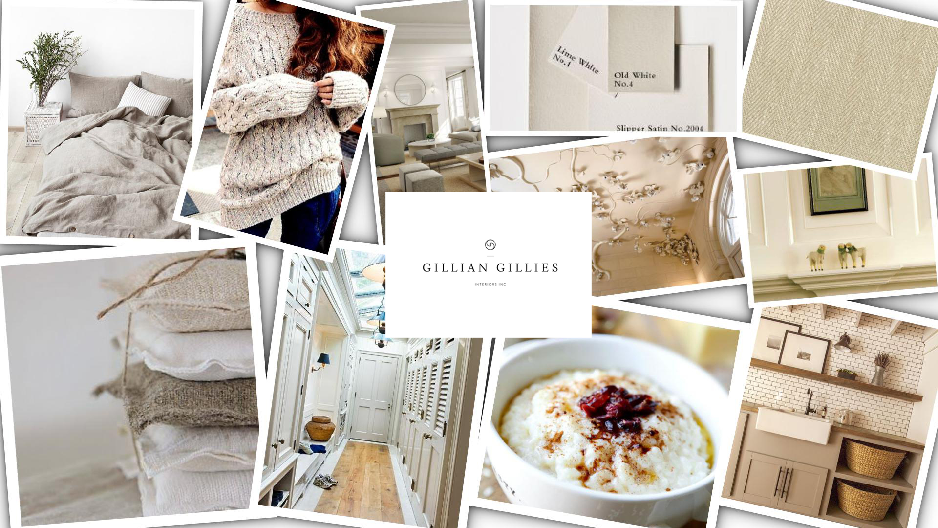
Inspiration – Oatmeal
Oatmeal is always a favoured colour in my design schemes – it’s the perfect shade to balance warmer hues in a room and it also adds warmth to cooler tones.
It’s a very liveable colour and it looks great in the form of rumpled linens on a bed. upholstered onto a tailored piece of furniture or as an accent throw in a room. Farrow & Ball have some of the best oatmeal paint colours from Shadow White and Shaded White to my new favourite Drop Cloth. Knubb-ily (apparently not a real word!) weaves or those with a herringbone pattern are classic materials that will stand the test of time.
At this cooler time of year, nothing – in my humble opinion – beats a bowl of steaming porridge to start your day. Actually, who am I kidding, I have porridge 12 months of the year. It’s genetic.
Watch this space as I’m currently in the throws (no pun intended) of designing some 100% Shetland wool throws. I am working with an amazing mill in Scotland and can’t wait to finalize the designs and colours. One of the colours is guaranteed to be oatmeal!
All images can be found on my Pinterest board Oatmeal.
All images are inspiration images and are not examples of my own work.
Studio Collection
Shop our latest, small-batch findings – perfect for you, your home or for unique gifts.
SHOP NOW
