Springboard for Future Things
February
I hope your February was – is, we are not through it yet – filled with love and contentment.
I find that during the month of February I begin to start thinking of spring and all that she brings with it. I start thinking of what I want in my planters, what herbs I’ll grow in my garden and what pieces are missing from my closet and what my travel plans are.
February welcomed a surge of design enquiries, and shopping on our site’s Studio Collection, and so I know I am not alone in using this month as a springboard for future things. I think we often take our cue from mother nature, whilst all looks still and quiet in the garden, things are being hatched and awakening from their winter slumber.
Our role at GGI is to tell our clients’ story, to be the custodian of their wants and wishes and to make all come true as smoothly and efficiently as possible, whilst still exceeding expectations and throwing in a healthy dose of magic.
One way to convey our design intent, to show our clients how we will tell their story is to produce hand sketches or 3-D Renderings.
AI as we all know is making great strides into all areas of our lives – from Google’s Alexa and Apple’s Siri to Samsung’s Smart Fridge that can tell you what you can make from what you have on hand (mine would have to revolve around cheese, potatoes and radishes) – we probably all have a touch of AI in our lives and in our homes.
The Good & Bad
Renderings are a great way to show clients what their home can look like before any work starts on site but it’s not only design firms that use them.
Lots of furniture companies will render pieces and place them for sale on their site – it’s a lot less money that filling a warehouse with items that may or may not sell, but if you don’t know it’s a rendering, and you purchase, do you really know what you are getting? This is the dark side of rendering; it can be very misleading.
I frequently see posts on Instagram and entire homes portfolios on websites – builders, designers, architects, and realtors that are renders, they are not real, they might not even be possible, the person posting may not be able to create in real life what they can create on their computer, they may never have had a client project before or been able to see one through to completion.
I am all for showing what’s coming – we do it in our portfolio pages when we have projects that we have yet to shoot, but we clearly state that they are rendered and once a project has been photographed, we remove the render from our website.
I use them to give our clients the confidence to say yes, and to show what we are working on. Never will they be used without clearly stating what they are.
We do our rendering in–house and use a mix of up to four different software platforms to create the finished version – we have our own base recipe that we tweak accordingly depending on the project.
The recipe tweak below is one of my favourite looks as it gives the space a painterly, tactile feel. For years I rejected the use of 3-D renders as they all looked in my humble opinion fake and harsh and not at all in alignment with what we want to deliver for our clients. But fast forward several years and things have really softened. It also really helps to have a fantastic designer in-house who can do all this work for us, who knows our vision and our brand and what we stand for. This ensures that all looks harmonious and in alignment with what you would expect from us.
Gracious Old Mill Penthouse
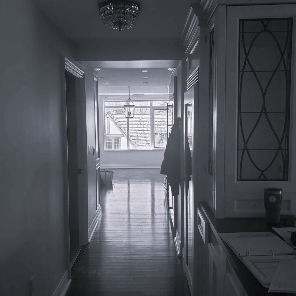
This is the entrance to my client’s pantry and kitchen; it started life like this.
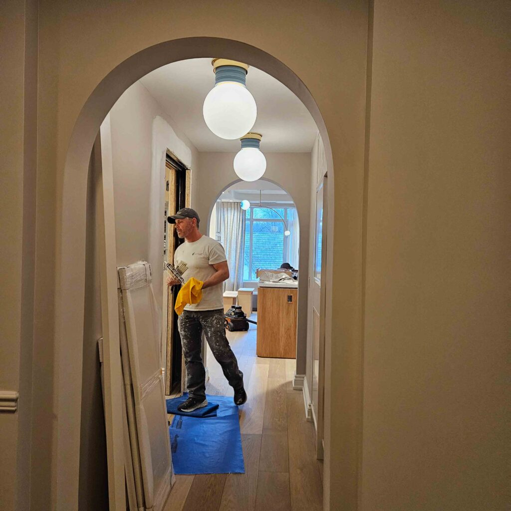
This is the same space nearing the end of construction – the double archways have been formed – for context the second archway is on the other side of the ceiling bulkhead which we managed to remove during construction.
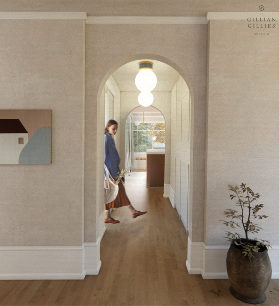
And this is the render below, minus the boys and all their stuff! It evokes a lovely feeling in the space, and it cannot be mistaken for the real thing, but to me, it gives a lovely immersive feeling.
We have this home scheduled to shoot in June and can’t wait to share the photos with you. It’s a really lovely home.
Rosedale Renovation
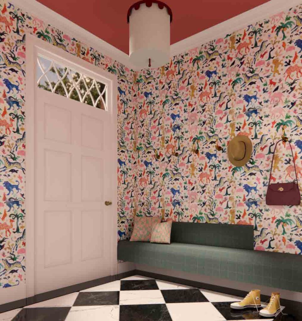
This 3-D style of rendering has an almost photographic quality to it.
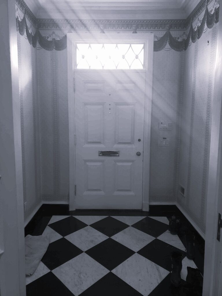
This is how the foyer looked originally. We kept all the original moldings and had the fabulous marble chequerboard floor refinished.
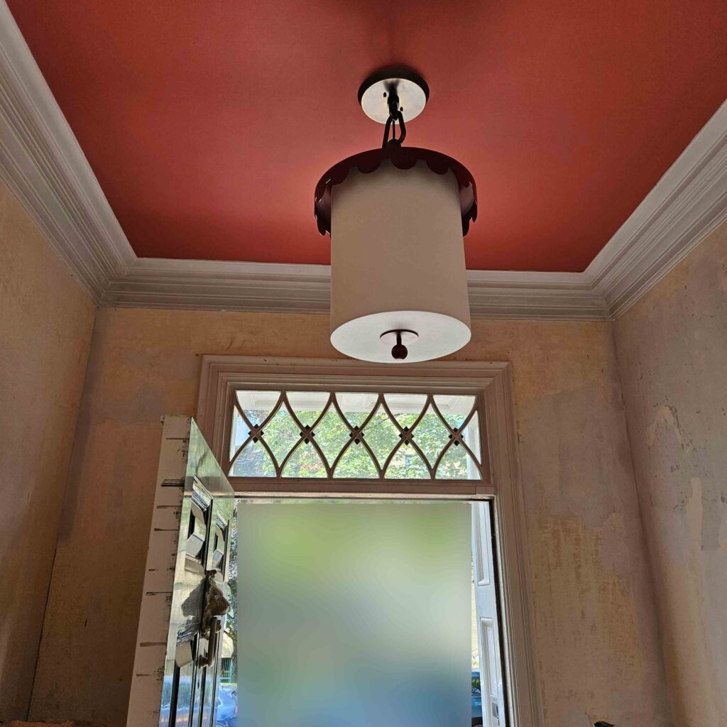
Here’s a bad photo, but still a photo showing the lipstick red ceiling and the fabulous pendant light. Here we are waiting for wallpaper but seeing as everything came through this space the wallpaper was the last thing to go in!
And here is our rendering, now in this one we have taken the liberty of widening the foyer to be able to show the space, in order to get this view you would in real life have to be standing outside in the garden beds, looking through the wall, but the content is true to what we delivered to our clients with the floating built-in bench upholstered in a contemporary plaid.
I adore this space; the paper is fun and who doesn’t want to come home to multiple happy camels on their walls.
Do you have a preference? Please let us know if you have a favourite style of rendering from the two shown or what your take on renderings is! Enquiring minds need to know.
Design Shows
Spring brings a plethora of design shows and this year I have made the decision to venture back to High Point Market in April. It’s been seven years since I was last at this show, well it’s really an entire town – over 10,000,000 sq.ft. in temporary and permanent showrooms.
Located in North Carolina, it’s an easy flight there and back and I am so looking forward to seeing all my favourite vendors and meeting some new ones. This show is the place to go to sit test as many pieces of furniture as possible, it’s an opportunity to understand the scale, the fit and comfort.
I only take photos of the pieces I like and take notes about who the furniture might suit. It’s great if my travelling companion or salesperson is a different height to me as then I can really see if one chair will fit all, albeit sometimes with a strategically placed accent cushion.
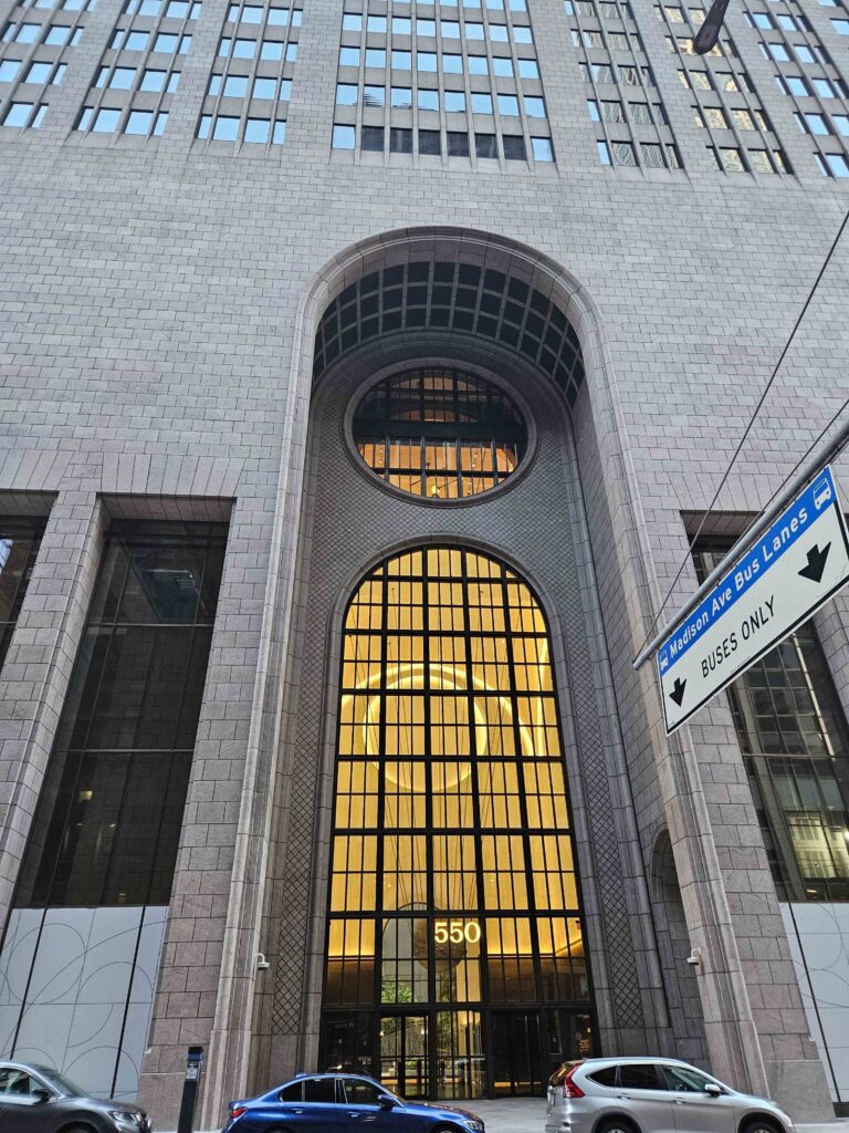
May brings ICFF New York, my favorite show and trip. I always feel that this is the launch of spring, it always lands on our Victoria Day long weekend, which is the only drawback, but it’s worth missing a holiday at home. We visit not only the show, but galleries, designer showrooms and the Kips Bay Decorators Showhouse. It makes for very full days and lots of steps on my tracker!
New Portfolio
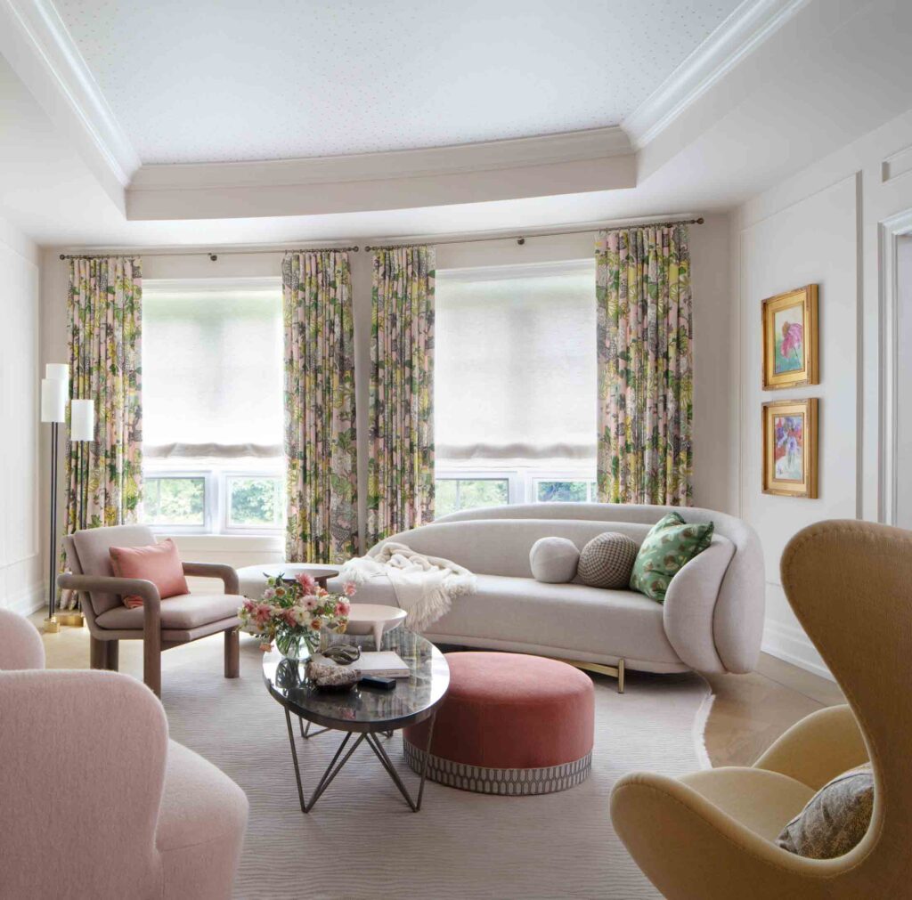
We added a beautiful new portfolio to our website this month. This was a dream project for a very dear client who gave us design autonomy which allowed us to deliver a space that feels so very different from what we had done before and yet was simply so right for what is needed now.
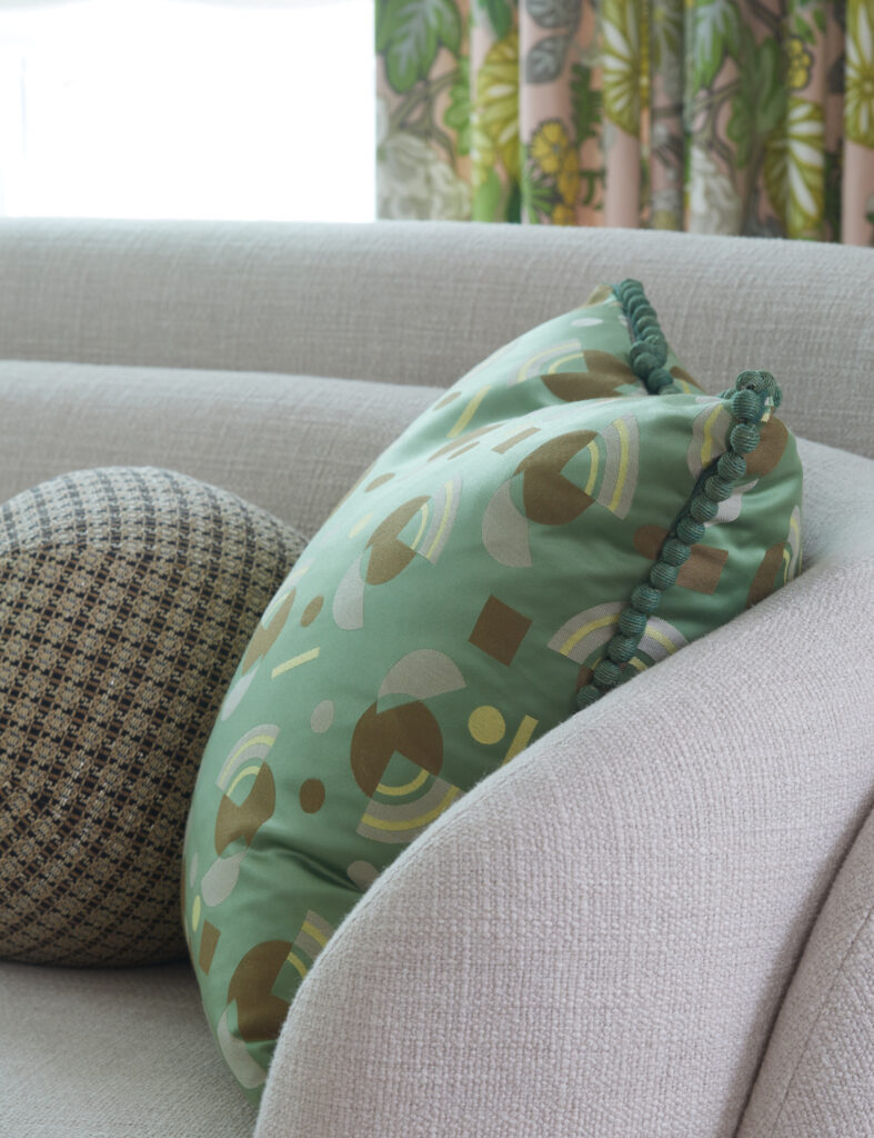
This townhome is built over five floors and the soft furnishings for the main floor set the tone for the entire home. Layers of pinks, greens and sophisticated yellows.
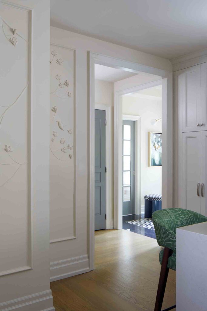
In the kitchen below we custom scaled a botanical plaster relief design that echo’s the botanical references seen throughout the home.
Please head over to our website to see all of the beautiful spring forward projects!!
Wishing you all a wonderful March. Thank you for your continued support and readership. I so appreciate you all,
Warmest,

Credits and other musings:
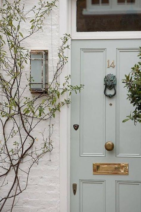
Delicious Cinamon & Gingers Roasted Pears with Vanilla Yoghurt, source FeedFeed, from our Pinterest Board Recipes. Christian Wijnants: Runway – Paris Fashion Week 2018/19, Getty images, from our Pinterest Board Fashion. Reimagined classical architecture, image sourced on Pinterest, source unknown, from our Pinterest Board Exteriors. A delicious front door in the perfect shade of sage, image sourced on Pinterest, source unknown, from our Pinterest Board Exteriors. A cozy corner from our Tactile Townhouse Transformation project. Photography Virginia Macdonald, styling Me & Mo. Our Old Mill Penthouse condo before image, by Gillian. Old Mill Penthouse Condo nearing the end of construction, photo by Gillian. Old Mill Penthouse Condo rendering by Gillian Gillies Interiors. Our Rosedale Renovation entrance foyer before, photo Gillian. Our Rosedale Renovation entrance foyer during construction, photo Gillian. Our Rosedale Renovation rendering. New York New York, photo by Gillian. The Living Room in our Tactile Townhouse Renovation & Decoration, interior design Gillian Gillies Interiors, construction Cliff & Evans, Photography Virginia Macdonald, styling Me & Mo. The Kitchen and Foyer in our Tactile Townhouse Renovation & Decoration, interior design Gillian Gillies Interiors, construction Cliff & Evans, Photography Virginia Macdonald, styling Me & Mo. Copyright © 2024 Gillian Gillies Interiors Inc., All rights reserved.
Studio Collection
Shop our latest, small-batch findings – perfect for you, your home or for unique gifts.
SHOP NOW
