Home is Sanctuary
February
It’s been a busy month at GGI, and I am so very grateful for that.
It’s wonderful to come into the studio each morning with a full to do list jam packed with lots of lovely creative things.
We’ve had three large presentations this month and I am so proud of the unique concepts and designs we (it takes several members of the GGI team to design and then produce the presentation materials) have come up with for each of our clients.
When you are creating multiple bathrooms, bedrooms, living spaces and kitchens it’s so important to keep each project tailored to each of the homeowners.
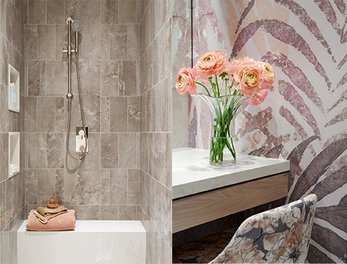
We presented designs for twelve bathrooms in February, and each had unique plumbing considerations and layouts, and all were designed with tiles and stone sourced specifically for each project.
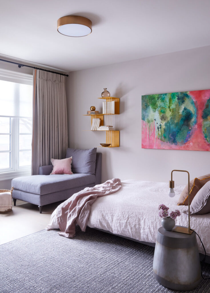
Each of these bathrooms also came with at least one bedroom to design as well as closets so there were a lot of lovely headboards, lighting, casegoods and an abundance of fabrics too.
I think that creating gorgeous private spaces for our clients is my favourite part of the residential design process as it’s truly a design for each individual.
In these spaces we can take care of our clients and provide them with a space that meets their needs.
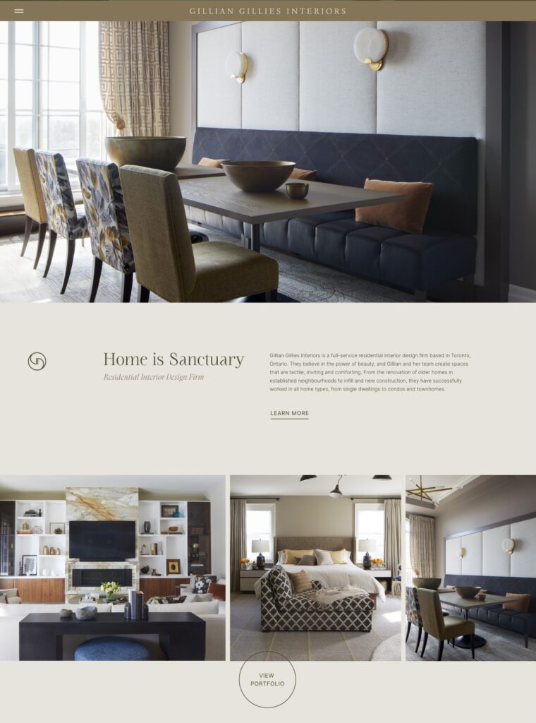
As our website home page states – Home is Sanctuary – and there is no better space to start with a selfcare plan than with your bedroom and bathroom.
Our Website
Last summer when we launched our new website, I was filmed for a few videos on our site.
The most viewed one being on our home page. Here my team had come up with 73 rapid fire questions to ask me. I did not know what the questions were, all I knew was the direction I was to walk in and that I was to make a cup of tea.
Sometimes you need to be invited to answer something by someone asking a question for you to learn what your answer will be. There were several answers I gave that surprised me!
However, there were several that talk about the pride, pleasure, and responsibility of getting it all right and how I love being able to take care of people – these came as no surprise to me or my team.
We love solving problems, creating space where it didn’t exist before and we know what is going to work, and we love to share our knowledge and experience.
Click below to watch the rapid-fire video!
When we start working with new clients, we have a questionnaire that covers a multitude of seemingly random questions (not as many as 73).
When answered they help me and the team build and design spaces that meet our clients needs, from how and what they like to eat and cook, to if they read books or use a digital device.
All these answers build a picture and give us insight into them and their family. I learned a lot about my answers and I know our clients also gain insight into themselves with their answers.
Loving Yourself
I am writing this newsletter the Friday before it is published. Today is National Self-Care Day – who knew, well apparently our Instagram posting tool did and it advised us and so we posted about looking after yourself which is something that I care deeply about.
Self-care has become a much-overused phrase but to me it means taking the time to look after yourself. This can be something simple – like listening to a podcast, going on a walk or reading a good book in a hot bath.
Or it can be more of a longer term goal, getting fit, feeling confident in how you look, learning a new language or planning a vacation. It can also be living with less friction and having space for what you love, which leads me to our latest bit of press.
Recently Published
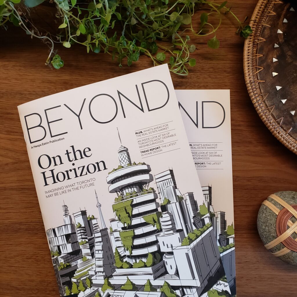
I was recently interviewed for the inaugural issue of Beyond Magazine by Heaps Estrin Realty.
I was asked what I believed the trends were for this year. Now if you have watched my 73 Questions video you know that the word trend can fill me with dread and horror as so many trends are disposable and our clients don’t come to us for quick fixes, they come to us to invest in themselves and their property – very much in alignment with what Heaps Estrin provides for their clients.
I spoke about the things that I feel are becoming more important for people to have in their homes. For us we have seen a significant rise in clients wanting to add wellness centers and spas to their home.
Home gyms have only become more important and necessary since the spring of 2020, but clients want a space that feels, looks, and smells good, no more stinky rubber gym flooring off gassing for months on end and no more harsh lighting.
These are trends that I can certainly stand by as they speak to improving our client’s long-term health and wellbeing.
You can read the magazine here.
Recently Completed
We had this gorgeous main floor renovation photographed last fall and although I’ve shown some images on Instagram I have yet to do a deep dive into it.
This space is located in the Forest Hill neighbourhood in Toronto and it’s a 3+1 story townhouse.
It began life looking like this…
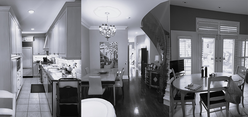
The wall at the end of the dining room table with the large piece of art (that I love and was an inspiration for the colour palette) on it, is the back wall to the kitchen.
It was only accessible from the breakfast room; it was narrow and tight and left whoever was cooking cut isolated from the rest of chat and conversation going on.
The existing floor plan gave my clients an entrance foyer, living room with fireplace, formal dining room, kitchen, powder room, and breakfast room. We simplified all by removing the living room and placing the dining room here.
We placed the kitchen in the space that was originally the dining room and opened up the back of the main floor to provide a warm and inviting family room with fireplace.
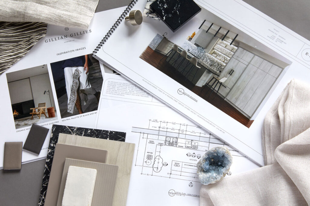
Floor plans, inspiration images and sampling were designed and sourced, and 3-D renderings were produced for client approval.
3-D renderings are a great way to see your space with all the selections before you commit.
Sometimes it can be really hard to visualize, especially when you are making such a dramatic change or building new.
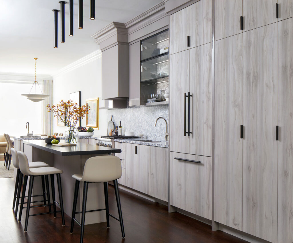
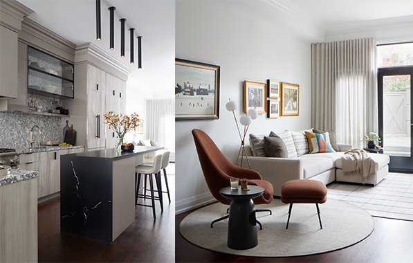
The end result is quite the transformation! The space feels so much larger and airy, the main floor is light filled and the hard finishes and soft furnishings complement and support each other and provide the perfect backdrop for our clients’ art.
If you compare the 3-D render with the finished kitchen below they are almost identical! The 3-D render is on the right 😊
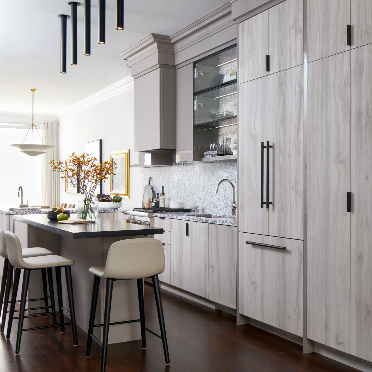
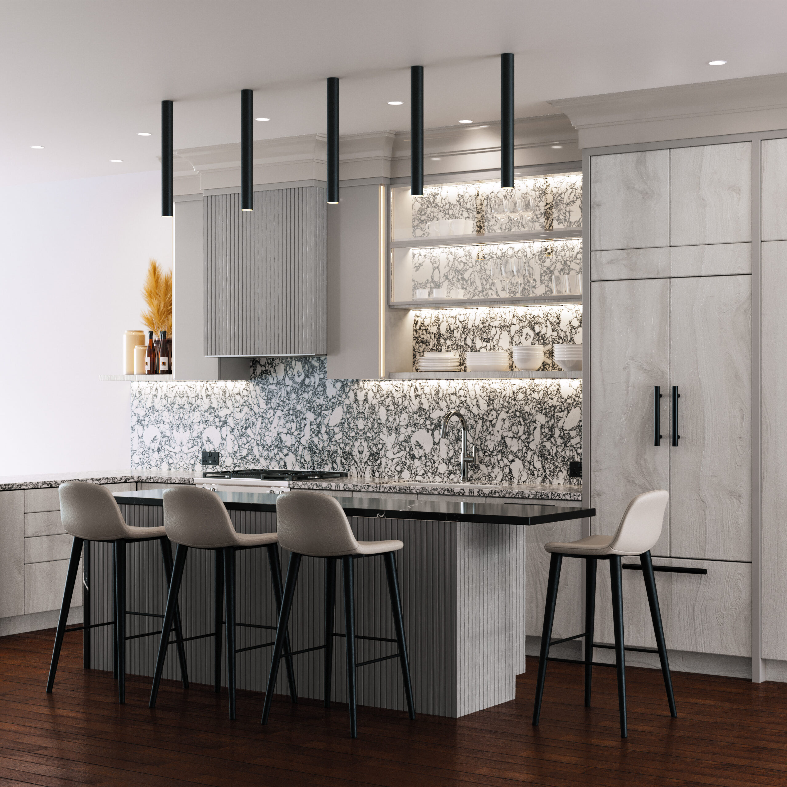
We love what we do, and I believe that all of these after images show the care and attention we give to our clients.
Getting to the end of a project, with all items installed, including art on the walls, styling pieces on the shelves – all those little touches that truly are the magic that draws your eye around the room.
It starts with a plan and a known destination and ends with happy clients!
Wishing you all a wonderful March!
Happy Spring Solstice when it comes.

Giving credit & thanks and some more musings while I am at it!
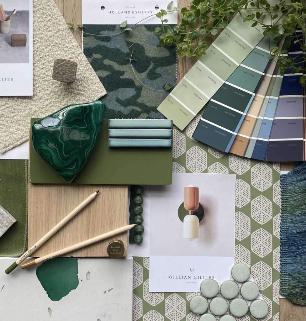
Linen curtain detail with assorted grosgrain ribbon bands Chez Pierre Frey, Image saved on GGI Pinterest Board Fabrics , sourced via frenchyfancy.com, Dries Van Noten Spring 2023 Ready to Wear Fashion Show. Impeccable detailing! Image saved on GGI Pinterest Board – Fashion, sourced via vogue.com, Scalloped Millwork detail, Jacqui Turk Interior Design, Image saved on GGI Pinterest Board – Millwork. A cottage inspired bathroom palette by Gillian Gillies Interiors, Primary En-Suite from our Burkebrook Penthouse with custom wallpaper. Gillian Gillies Interiors. Photography Virginia Macdonald, styling Me & Mo., Website launch graphics, designed by Ashley Malone. Her Bedroom from our Lytton Park New Build. Gillian Gillies Interiors. Photography Virginia Macdonald, styling Me & Mo, Heaps Estrin Beyond inaugural issue photo taken in the GGI studio, Open concept completed kitchen from our Forest Hill Townhouse project. Gillian Gillies Interiors. Photography Virginia Macdonald, styling Me & Mo. Before images of our Forest Hill Townhouse project. Gillian Gillies Interiors, Design presentation package for our Forest Hill Townhouse project. Gillian Gillies Interiors. Photography Virginia Macdonald. Open concept completed kitchen and family room from our Forest Hill Townhouse project. Gillian Gillies Interiors. Photography Virginia Macdonald, styling Me & Mo. 3-D rendering (left) of our Forest Hill Townhouse project. Gillian Gillies Interiors. This drawing was produced before works on site started.
Copyright © 2022 Gillian Gillies Interiors Inc., All rights reserved.
Studio Collection
Shop our latest, small-batch findings – perfect for you, your home or for unique gifts.
SHOP NOW
