Springing into Style
March
Are we there yet? March certainly kept us on our toes – we had warmth and sunny days combined with blizzards and driving rain.
I left the house wearing a wool cardigan coat one day only to regret it several hours later as the rain began to pound down.
March found me, in addition to dodging weather and not having a clue what to wear, designing several foyers and staircases. The foyer can seem to many, a transition space to pass through, to me it can (and should) be the anchor point in a house’s design scheme.
It’s the first impression, it sets the tone, the stage and offers insight into what you might find beyond. No matter how diminutive or grand, I always feel that a foyer should be a place to welcome not simply your guests, but you, the homeowner back. It’s the anchor to the house, your point of arrival and departure, your touchstone.
There is a lovely book by British author Alain de Botton called The Architecture of Happiness, that has a passage in the beginning that talks to the house being almost human in the noises and sounds it makes.
He speaks about how older homes would creak, belch and moan as they absorbed the flow of people in and out and how when even empty, after the front door has been slammed shut, they are still creaking, with pipes gurgling and ducting expanding or cooling.
For me the humble foyer is the workhorse and I think that it probably breathes a sigh of relief when it’s free of people and their stuff and it can simply be.
A foyer has to do several things – absorb the elements – both heat and cold.
Temporarily store outerwear and shoes which can be wet, snowy and salty, provide seating and storage and give you pause with a mirror before you leave.
Oh, and also look fabulous and welcoming.
A Tale of Three Foyers
Below are some foyers we have recently completed – all quite different in scale and design, but all three cover all the bases I feel! What is consistent in all homes, is that each has a garage / mudroom / elevator entrance in addition to the front door / foyer entrance. This is a combination we are seeing more and more of in our designs.
1.
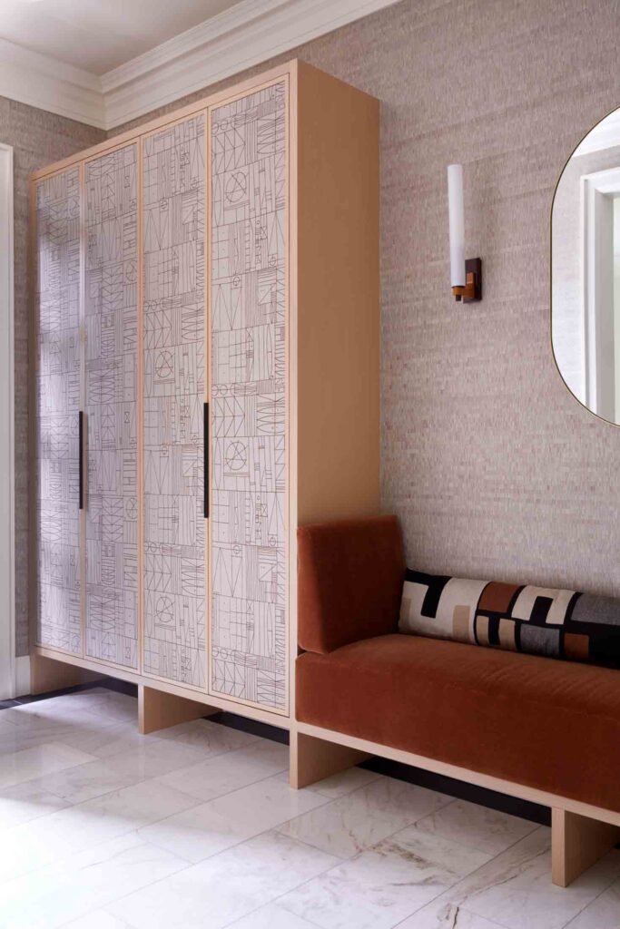
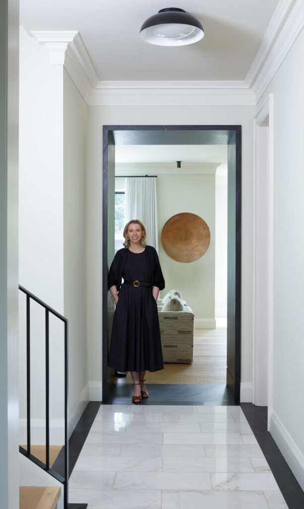
Firstly, this gorgeous new-build we recently completed. This home has a large mudroom which connects the side entrance and the garage, so it houses the majority of the homeowners’ coat and shoe storage. The foyer was originally designed without any guest closet and had a console / mirror / table lamp combination drawn on the plans.
Although we did not have enough depth to hang coat hangers side to side (as you do in a standard closet) we worked around this and stacked one in front of each other – the perfect spot for guest coats and we also added hooks for light weight jackets and scarves. The upholstered doors on the millwork are a favourite design element of mine that we incorporate in a lot of our design projects and custom furniture pieces, but this was a first in an entrance. I adore this pattern and the softness it brings to a space with a lot of hard elements.
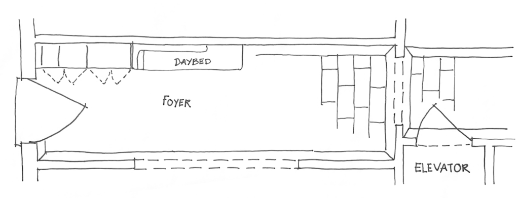
Scattered shoes in an entrance to me are simply bad planning – always allow for open space for boot trays, in this case our millwork was scaled to accommodate two boot trays under the closet to allow guest shoes to be able to be placed out of the way of the door.
Yes, the rubber trays were the boss of the millwork dimensions. Start with what you want and build around them even if it’s a $15.00 boot tray.
The floor tiles are a large 24” x 48” natural stone tile that we have bordered with a black slate. The black slate is then wrapped around the entrance to the family room and kitchen, but back to the foyer.
The upholstered banquette allows for space to sit and take off your shoes and in the winter, inclement months we have a custom indoor-outdoor carpet in a colour similar to the stone.
I don’t know why indoor-outdoor carpets come in black, all they do is show everything – go with a lighter neutral and scale it to suit your space. In this space we have delicious wall sconces flanking the mirror and a quiet flush mount for overhead lighting that doesn’t compete the with dining room that opens onto the entrance hall.
2.
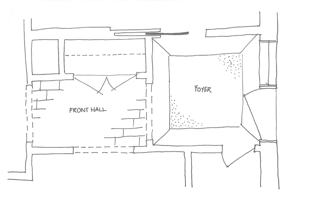
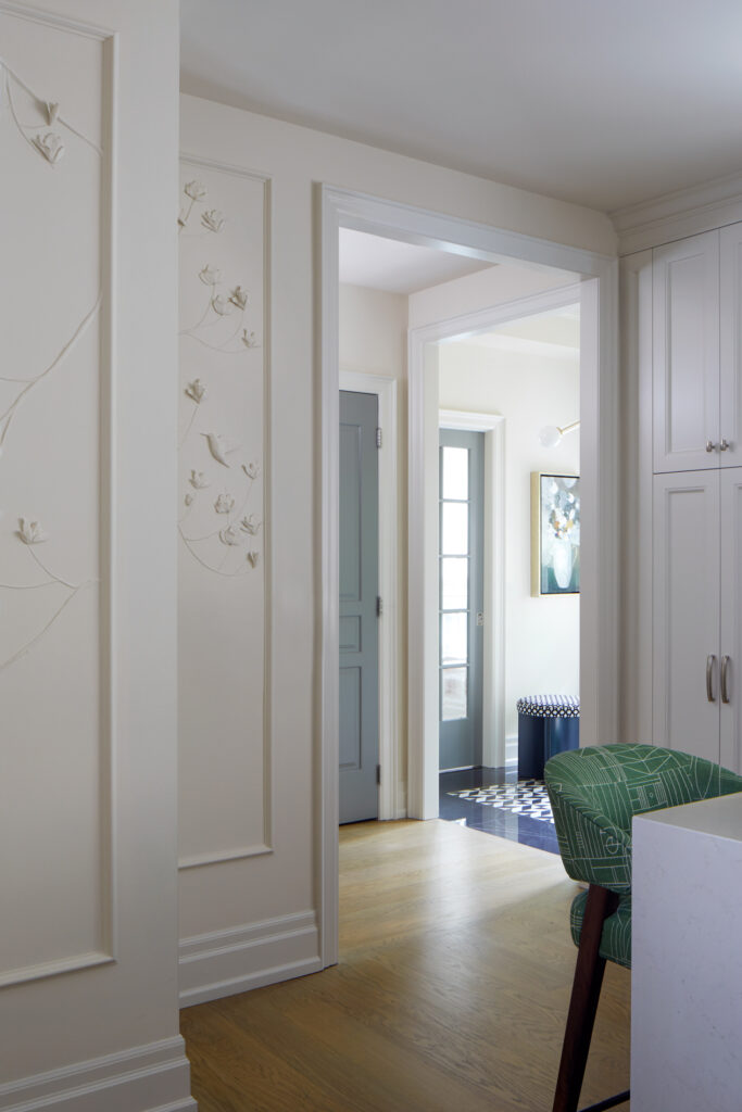
Secondly this townhome entrance is diminutive, but it still has all the elements we want. This space has a large closet in the entrance so the homeowner’s outerwear along with guest coats are easily stored here.
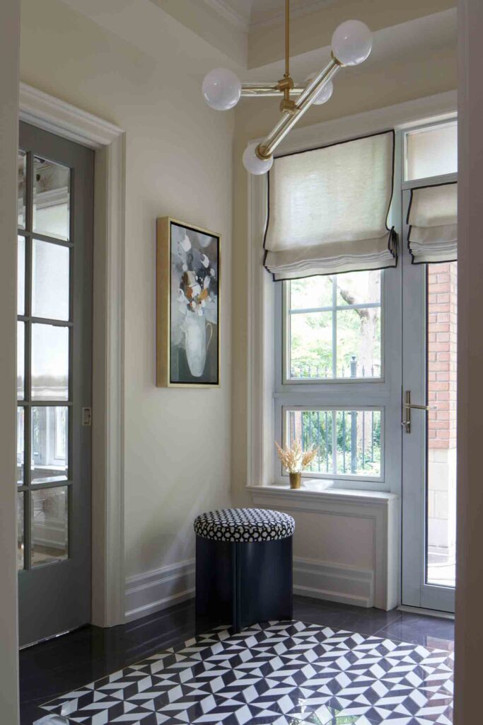
We opted for a striking floor that features ebony and ivory mosaic tiles in a geometric pattern. The tiles are scaled to suit the space, this is key in making all look good. The striking light fixture made by the charming and artistic duo at Trueing adds a layer of polish and the brass adds just the right amount of sparkle.
The round stool has a fluted metal base and is upholstered in a graphic pattern. The fabric is by Metaphores which is the gorgeous Parisian design house that is owned by Hermes. They make a lot of stunning fabrics that we curated and added here and there in this project.
The window blinds are made in a wool / linen blend and have a soft organic pattern that offers privacy whilst still letting the light penetrate. Edged with a black grosgrain ribbon they effortlessly divine the space.
The closet doors are painted out in a soft slate that adds depth and character to this space.
3.
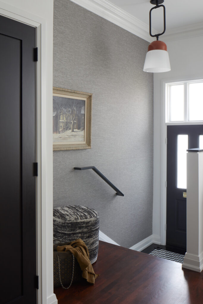
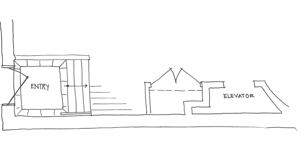
Finally, in this Forest Hill townhome we extensively remodeled the main floor including the entrance foyer. There are stairs up to the main floor as soon as you enter the home on foot.
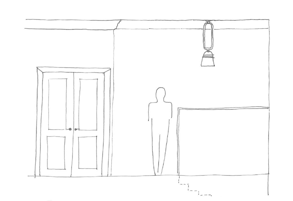
Previously the hall closet was located at the side of the front door. It made for a bulky half-height wall in the living room above and so we relocated the closet to the top of the stairs.
We did however keep shoe storage in the knee wall at the entrance so that all is concealed, and they don’t become a tripping hazard either at the top or bottom of the stairs.
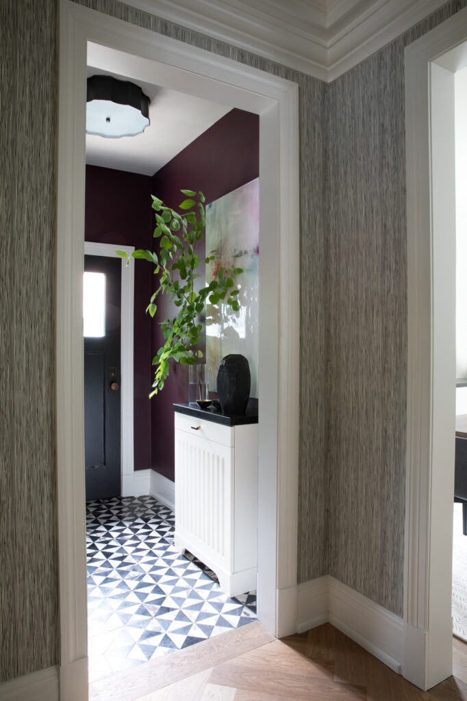
We added a gorgeous black and white floor tile – another mosaic scaled to suit the size of the space and welcome people in.
The handrail wall was wrapped with a gorgeous textile wallpaper in a charcoal weave and the closet doors were painted out black and all the hardware was updated to black. The handrail was streamlined to a simple flat profile in a black metal.
The hall closet was tucked into a space at the side of the elevator and we added a gorgeous terracotta pendant for a little punch of colour which is also seen around the home.
I love all these designs, curated for each specific homeowner, their house and their needs. With all this crazy weather I know these spaces have been working hard!
Need more inspiration, check out last month’s journal to see the rendering of another entrance foyer with a lipstick pink ceiling! It’s delicious.
New Collections
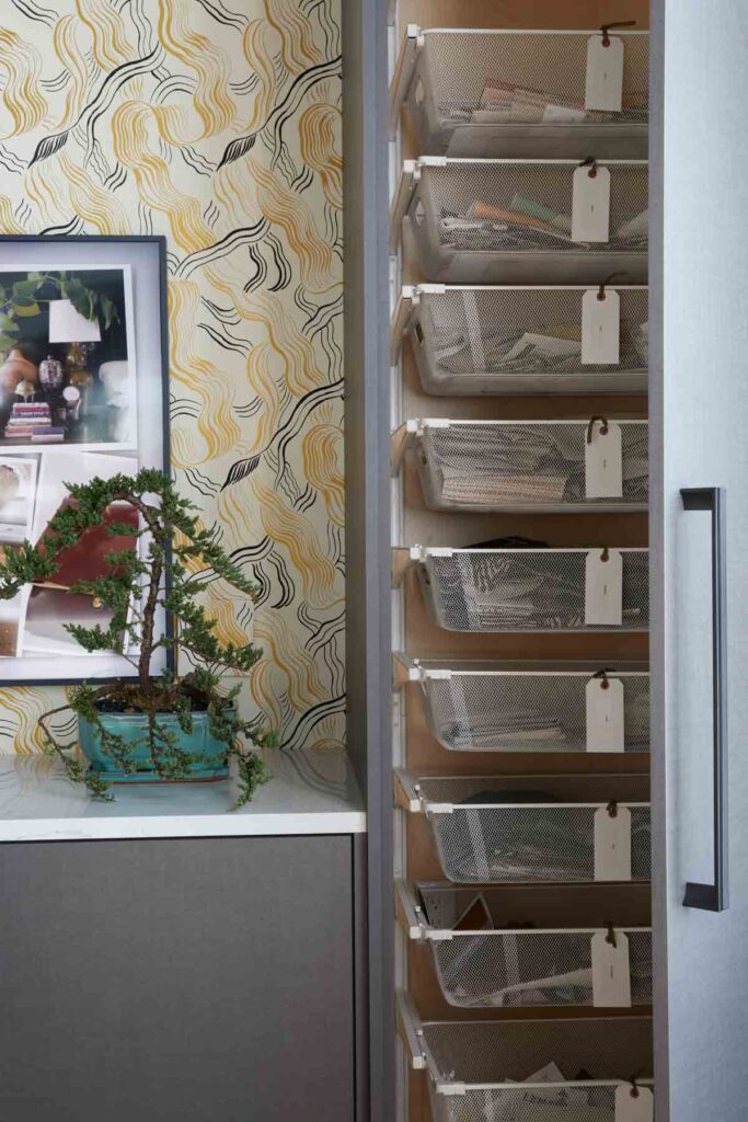
Our sample storage is not looking as neat and tidy as the photo above but it’s all good and I am grateful that it’s concealed behind doors.
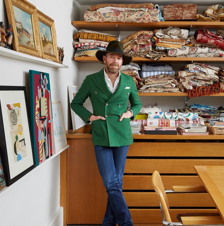
Spring is where we see lots of lovely new things and l am in love with the offerings from Sandra Jordan, originally from Peru, Sandra works with alpaca’s and her fabrics are as lovely and as authentic as she is.
New collections have arrived from Pierre Frey that I first previewed in Paris. I adore their use of colour and the sheer joy that emanates from their fabrics and wallpapers.
New Studio Collections
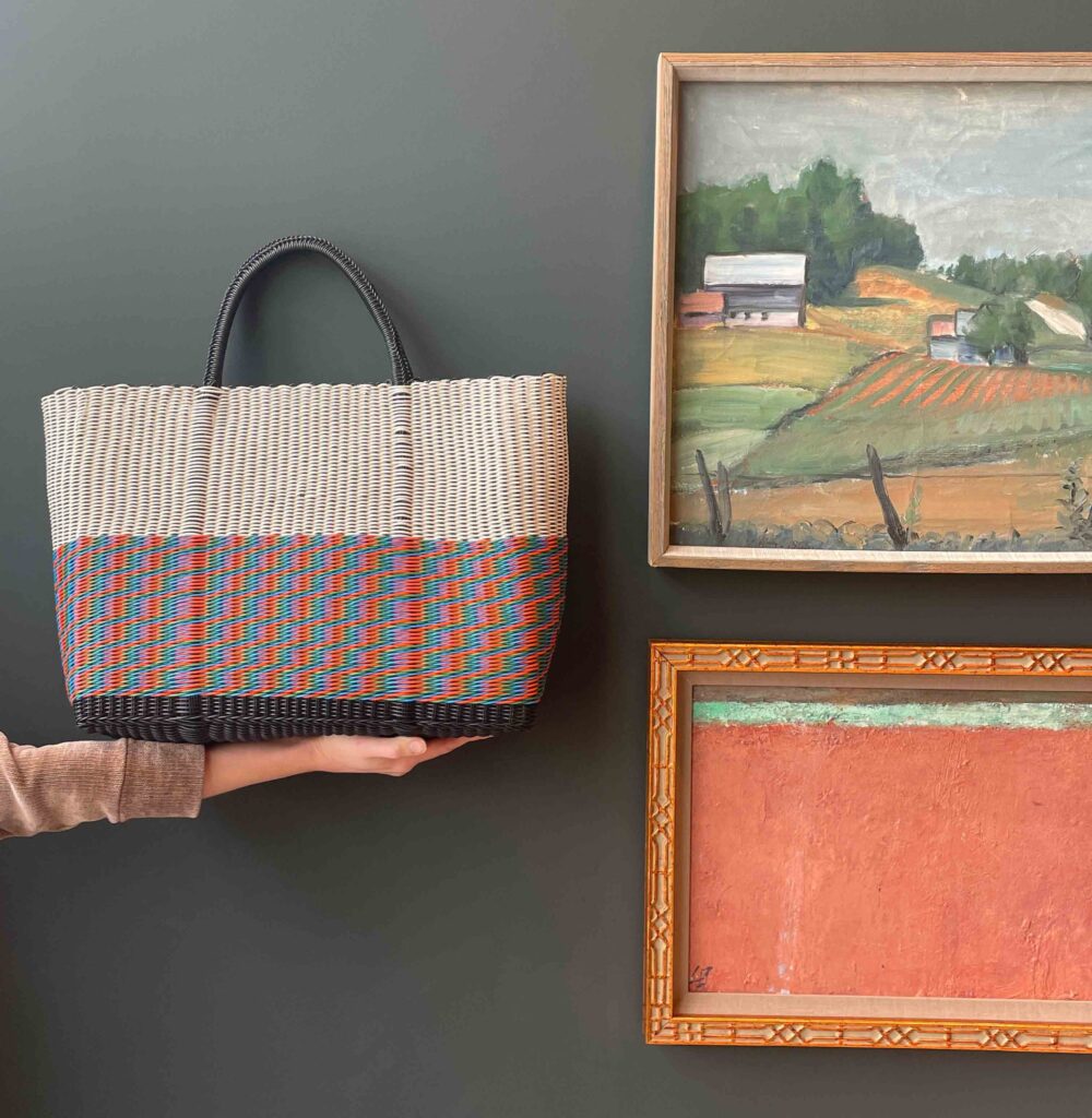
Just freshly arrived from Oaxaca, Mexico we have a beautifully colourful collection of bags made from recycled plastic.
Perfect for all your carrying needs. They come in three sizes and we have one of each design / colourway. So if you see one you love, grab it now. Every day I find a new favourite. They really are works of art but oh so very practical and durable.
Bags can be gift wrapped and delivered or picked up from our studio – purchase online and pop in and say hello, we’d love to see and meet you.
Shelter
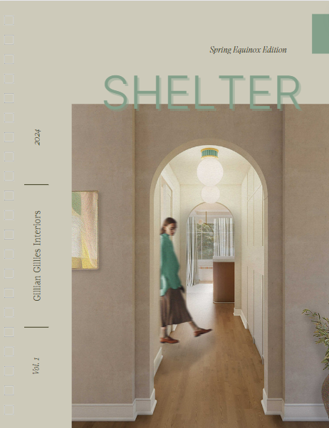
Last week we launched our new digital publication, Shelter. It went live on the date of the spring equinox, a day that coincided with my wool cardigan coat and a downpour of rain and a blizzard……….anyhow, we all survived and I hope you liked the magazine.
As a subscriber to our monthly newsletter you were given priority access, but in case you were distracted or didn’t see the link it can be found here. Thank you all for your reading, support and feedback.
Wishing you a wonderful Easter weekend.
Warmest,

Credits and additional musings:
1 Vibrant Spring Soup – which looks so good it might even have me in the kitchen making it. Sourced on our Pinterest board Recipes, from acouplecooks.com. 2 The perfect scalloped powder blue entrance settle. Sourced on Pinterest, design by @dunbarroad, photography @nathanschroderphoto. 3 Blooming, sourced on Pinterest, source unknown. One day I want to buy this big a bunch of flowers and have the upper body strength to carry them a couple of city blocks #lifegoals. 4 Our Heritage Townhouse entrance foyer, diminutive in size but packed with form and function – a rad cover also holds keys and unseen is the large hall closet to corral coats and shoes. Design, Gillian Gillies Interiors, photography Virgina Macdonald, art direction and styling Me & Mo. 5 Our Midtown Quiet Luxury project’s entrance foyer! Love love love this upholstered closet. Design, Gillian Gillies Interiors, photography Virginia Macdonald, art direction and styling Me & Mo 6 Our Midtown Quiet Luxury project’s entrance foyer in plan. Design, Gillian Gillies Interiors 7 Our Midtown Quiet Luxury project’s slate wrapped entrance to the family room. Divine. Design, Gillian Gillies Interiors, photography Virginia Macdonald, art direction and styling Me & Mo. 8 Our Tactile Townhouse project’s entrance foyer. Curated and edited with beautiful finishes. Design, Gillian Gillies Interiors, photography Virginia Macdonald, art direction and styling Me & Mo. 9 Our Tactile Townhouse project’s entrance foyer in plan. Design, Gillian Gillies Interiors. 10 Our Tactile Townhouse project’s entrance foyer as seen from the kitchen. Design, Gillian Gillies Interiors, photography Virginia Macdonald, art direction and styling Me & Mo. 11 Our Forest Hill Townhouse projects entrance foyer. I am coveting this pendant light for my own home, available in any colour you can imagine it’s an understated statement. Design, Gillian Gillies Interiors, photography Virginia Macdonald, art direction and styling Me & Mo. 12 Our Forest Hill Townhouse projects entrance foyer in plan. Design, Gillian Gillies Interiors. 13 Our Forest Hill Townhouse projects family room with a cheeky terracotta accent. Design, Gillian Gillies Interiors, photography Virginia Macdonald, art direction and styling Me & Mo. 14Our studio fabric library – not always this pretty but full of surprises and beauty. Design, Gillian Gillies Interiors, photography Virginia Macdonald, art direction and styling Me & Mo. 15 Sandra Jordan – this photos makes me want to work with alpacas too. 16 The house of Pierre Frey features wonderful patterns and colours. 17 Studio Collection bags. We love these. 18 Shelter – The Spring Equinox Edition.
Copyright © 2024 Gillian Gillies Interiors Inc., All rights reserved.
Studio Collection
Shop our latest, small-batch findings – perfect for you, your home or for unique gifts.
SHOP NOW
